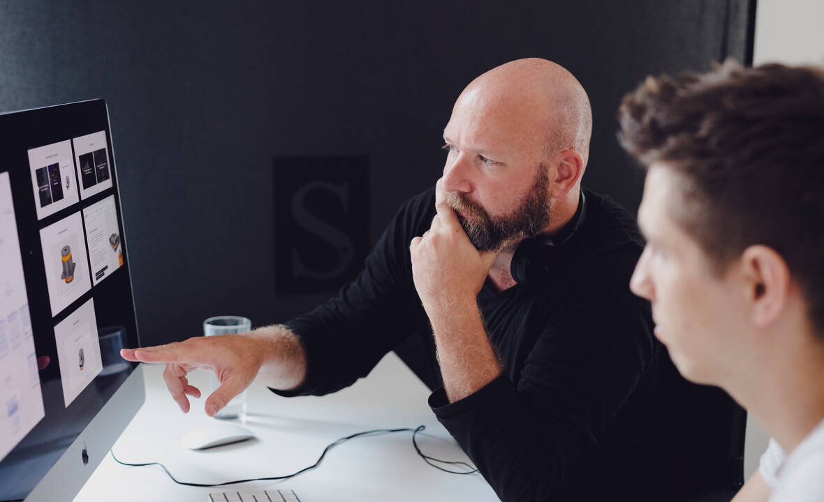
Improve collaboration between developers and designers

As everybody in the marketing and communications industry well knows, designers and programmers not always see eye-to-eye. Yet, the way they interact and communicate with each other has a direct impact on the final products they're collaborating on. One can go so far as to say that, when talking about website, software or app development, a design without programming is useless, and programming without design, is unusable. So clearly, it's in every stakeholder's interest that this gap is bridged. Why does this happen and what can we do to make the life of our geek friends a little easier?
The different approach designers and programmers have to problem-solving, within given constraints, is basically the start of all problems.
In a nutshell, designers have a complex, extravagant and inclusive process that comes up with solutions that are user-oriented, regardless of the technical difficulty behind a solution. Factors such as branding, usability, accessibility, visual appeal, consumer psychology, etc. all play a role. Programmers, on the other hand, have a systematical, mathematical and exclusive process that is solution-centred. Good code is simple, elegant and aesthetically pleasing.
So how can we work better together?
The first thing is to just acknowledge this difference, understand it, and respect each other's limitations. Both views and approaches are equally important to how the ultimate problem will be solved. And this is why it's paramount design and development work very closely. If possible, programmers should take part in pre-design phases and in design reviews. If during the design phase of a project decisions are made together, then they're balanced with both perspectives.
If this is not possible, then, there are other ways to collaborate better:
Know the basics from each other's craft
In my opinion, designers should design, and coders should code. Quality and profitability can suffer when specialists stretch themselves too much by trying to do it all (poorly). But both should, at least, understand the basic principles of each other's craft to create practical products that can actually be built, and that clients can maintain. If we can all speak a common language, then we can transcribe our ideas better.
Use the same building blocks
UI’s are made up of a lot of reusable components like forms, text styles and containers. These components make up the overall templates of our digital products, and when they make sense and are part of a system, the world is a happier place. These systems are also known as "design systems", or “components library” or “front-end framework”, like Bootstrap, and Googles's Material Design, for example. The amount of customization needed will determine the size of the chosen framework to work with, but even the smallest ones are, already, beneficial to shorten the gap between design and code. Personally, I prefer working with small design systems, for they can more easily be personalized and built upon. Larger ones, like Google's Material Design, can represent hours of exploration and understanding of the overwhelming amount of components that most likely won't even be used in your project.
Work together in teams
Work in teams, not departments. The only way to enhance collaboration and communication is by working together. Depending on the size of the company, teams might be working on different features or products, and the way the teams are organized can be crucial. Traditional development teams are often organized as component teams, where the team will work on a component which then needs to be integrated with other components developed by other teams. When adopting an agile project management approach, a "feature team" will deliver the complete end-to-end feature, having made all of its components. At Pivotal Labs these team are called “Project Pods".
CSS on a silver platter
There was a time when designers would have to spend hours coming up with a CSS specification document, to show the programmers, among other things, the sizing and spacing of everything. But a lot of specs would get lost or forgotten, and the amount of QA for such small but important things during a typical workday would make productivity plummet. Nowadays, applications such as Zeplin or InVision allow designers to merely upload the artwork and enable developers to, not only view the files but, more importantly, see all CSS attributes. Easy cheesy.
Inspect by InVision from InVision on Vimeo.
Good assets are an asset
Most of the time, programmers get lost somewhere between "Layer 1" and "Layer 234503 copy V2". Good file management goes a long way here. Organize your folders in a logical subfolder structure and name your layers descriptively. Indicate elements with interactivity, such as hover states, for example. You can color code or add prefixes to layer names and folders. Delete all unused layers, export all Icons, fonts, images, etc. and hand them all off in neatly organized folders. All in all, be a good buddy and help a brother out.
The sum of it all
In the end, designers and programmers live in overlapping worlds and have a common objective: making applications that are user-friendly and engaging. The ways each one of us gets there, are different, but with a lot of common ground. If we all want to produce better work it's time to tear down the walls, recognize the differences, embrace the similarities, learn to empathize, speak a similar language, get everybody involved early on, meet and talk more often and care about what you're doing. Have fun!


